


Real World Map
The world is undoubtedly a wonderful territorial space where it is still a mystery how we got there. However, despite being our home for thousands and thousands of years, we still do not know exactly if what we see of it on the world maps shown in geography books is a true reflection of what each of the continents or countries are like.
In this sense, in order to improve our vision of the real world map, we will take a brief but enriching walk through the map of the world in reality, as well as the various cartographic projections or ways in which we can see it through cartography. All this so that we can get to know the different designs of our big and small world trying to decipher the enigma behind the Real World Map.
Are you passionate about maps? We invite you to take a brief tour through our gallery of World Maps.
What is the map of the world in reality?
According to what we have been able to investigate, there are several maps of the world that try to reflect the cartographic reality and make it possible for us to see all of its vast territory. But, each of them have errors that have been justified in the shape of the Earth itself.
This is explained in an installment of the New York TimesNo flat map of our round world can be perfect.
This is because the Earth has a round or oval shape and slightly flattened at the poles, and it would be necessary to remove the entire surface of it as a kind of skin and stretch it completely to be able to have the exact measurements or lengths of each territorial space.
It is believed then, that for that reason some continents or countries seem not to be faithfully represented in most maps.
In this sense, it is important that we think of them as a reference of the world and not as a faithful copy of it, because they seem to be adjusted to comply with the squareness of their particular shape and not to represent their geographical space as it exists.
The errors of the World Maps in an example
We have all probably seen a world map with enormous dimensions but... Why does this happen? We should not lose sight of what a world map really is. It is a graphic representation of a three-dimensional object in a two-dimensional one.
To take it to everyday life, it is like trying to cut the skin of an orange and make it completely flat. And it will certainly not be perfect, no matter how hard we try.
It has also happened with famous world maps that try to be real, although they show the existence of each of the continents and countries, if we talk about territorial extension, we will find several errors in them.


World maps: A reference and not a true representation of reality
Regarding this issue, some web portals related to the world map or that show reports on how we see the world or have made us know it, point out that the real world map is a lie.
A 2019 review of The Economist which points out that "world maps are useful to know the location of different countries, but when we talk about size there are problems".
And certainly, if we look for a continent it will be there, if we want to see the location of the countries we will see it there, and we even have maps where we will find the existing vegetation, the hydrography, among other elements.
But, if we want to see its territorial extension, the world map could fail us as in the case of Africa, which is much larger than what is shown in this one.
Likewise, countries such as Russia are visually shown as small countries, when their reality is different, since their territorial extension is much larger than what we are shown.
For this reason, virtual world mapshave emerged asthe The True Size OFwhere we can put a specific country, hit search and it will immediately show you, according to them, the real size of the country.
Other reasons for Map errors
Another explanation for the difference in size of the countries is that the closer a country gets to the equator, the smaller it gets and the closer it gets to the poles, the larger or more distorted it gets, a situation that you can see by clicking on the virtual world map of The True Size OF and have fun learning about it.
On the other hand, according to the location or relative position of the countries on the map, many believe that no one or no country is at the bottom or at the top, since the Earth as a celestial body is suspended in the universe.
There is simply no real reference to justify or point out that some countries are below or above; therefore, no matter how the map is positioned, it will always be correct as clearly explained in the video that we recommend below: click here.
In short, many specialists point out that the Mercator world map that we have been taught since 1569 is wrong, it is a deception where northern countries seem to benefit from its distribution and, although more real or accurate world maps have emerged, they still do not understand why it is still maintained.
Surprise someone special with the best gifts in the world.

What is a cartographic projection?
A cartographic projection, also called a graphic projection, is a drawing, a representation, a captured vision of the surface or geographic area of a given space.
In the case of the world map we would be talking about a representation of the surface of the Earth; in which, in order to be able to adapt to the maximum of its real shape and size, a series of lines and points are drawn in the form of a mesh called coordinates, which allow to calculate the total surface of each space minimizing the margin of error.
That is why when we look at a map, we notice many lines on them, their latitudes and longitudes which, in the case of sailors and aviators, as for world travelersIn the case of sailors and aviators, these are of vital importance to be able to locate themselves in the maritime, aerial or terrestrial space where they are.
In fact, the Encyclopedia Britannica in introducing the concept of cartographic projection tells us that it is a flat representation of the characteristics of the curved surfaces of the Earth or part of it and although it represents an obvious problem it never troubled the ancient or medieval cartographers.
Shall we take a little walk around the world? How about Costa Ricaor maybe Porto, o Prague.
What cartographic projections exist?
Within the field of geography and territorial or spatial distribution, we can find 5 types of cartographic projections, which in turn are divided into other subclasses. These show the world from different points of view and we summarize them briefly:
Cylindrical Cartographic Projections.
To understand this type of cartographic projection let's imagine a baseball inside a cylinder, we shrink it and open it on one side to observe all its sides. This is how the cylindrical projection is represented and the most famous are the following:

Mercator projection
The best known and most widely used cartographic projection of the Earth to this day; its advantage is that it graphically shows the distribution of the countries of the world.
But its almost obvious disadvantage is that it distorts the actual shape and size of many countries closer to the poles or equator.

Peters Projection
Another form of cylindrical projection that offers a view of the world.
Its advantage is that it does not disproportionate the size of the countries despite the angle at which they are located, while one of its disadvantages is that the places shown lack details that broaden the understanding of the space seen.

Robinson's projection
In it, its advantage is that it shows the whole world in a single image, but its disadvantage is that it does not conform, nor is it equivalent to the territories, since it seeks to show the entire surface and not its strict measurements.
Conic Cartographic Projections
As their name alludes, conic projections have in common their shape very similar to a cone. To be more specific, they resemble a birthday hat that we open in half.
This is because it is taken from one of the poles as a reference and expands, in order to be able to see all the countries.
This type of cartographic projections can be:

Simple conical projection
Here we take the axis that joins the two poles as the vertex, which allows us to see the countries that are inside these poles without leaving any of them out.

Lambert conformal projection
If you imagine a dancer taking her wide skirt by the two ends, it is a very graphic way to visualize this projection; which appears to be a circle in half extended to the maximum.

Conical map projection
In this type of conic map projection, several cones are superimposed, with the intention of not losing the real proportions of the Earth, so its shape may seem distorted to those who are passionate about perfect figures.
Azimuthal Cartographic Projections
This type of cartographic projection, so uncommonly named, seeks to represent the world taking into account the different characteristics of its surface, allowing it to be seen from different perspectives. Among the types of azimuthal cartographic projections we have:

Orthographic projection
This model aims to show people not only flat images, but a clearer idea of their volume and proportions.

Stereographic projection
It seeks to show more specific parts of the world through specific lines and points, supported on a horizontal plane.

Gnomonic projection
It is normally used to observe the distance between two points on the Earth, taking the center of the Earth as a reference. This system of cartographic projection provides such a guide that it is often used in aeronautics to establish the path to follow.

Lambert azimuthal projection
It seeks to show the areas of the earth's surface without a specific order, but keeping its territorial order.
Modified Cartographic Projections
Here are grouped all those cartographic projections that take as a base the already existing ones, but modify parts of them to adapt them to reality.
Nowadays the new cartographic projections belong to this group, since they depart from the classic works already carried out in the matter to reinforce or to refute aspects of the same ones.
Children learn better with creativity: Here are some examples of world maps for coloring. examples of World Map for coloring.
Conventional Cartographic Projections
In this category fall the group of many of the world maps that we usually see in books.
In which an aesthetic image of the countries in the world and their territories is offered, but which in most cases present certain distortions with respect to reality.
In this category of conventional cartographic projections we can name the following efforts to represent a real world map:

Aitoff projection
It is an azimuthal projection transformed by doubling its values to show a wider view of the world, so it does not conform to the real proportions, nor is it equivalent.

Screening of Bernard J.S. Cahill
It tries to show a more realistic world map reflected in the figure of a rubber ball that is flattened and shown in the shape of a butterfly, with geometric measures that allow it to return to its original shape.

Projection of Dymaxion
An attempt to demonstrate a real world map through various geometric shapes, particularly a "polyhedron" that can be unfolded in different ways to form an interesting two-dimensional projection.

Goode's projection
It is a somewhat uneven world map , but it is very useful to identify phenomena uniformly and not separately.

Screening of Kavrayskiy VII
It is an improved modification of Mercator's world map, where by making use of mathematics with respect to space and the location of certain areas, it was possible to greatly reduce the errors previously made. However, with this projection they could not improve the graphic representation of Antarctica and other remote places.

Miller cylindrical projection
A good effort to update the Mercator projection, which offers significant improvements, although there is still some distortion of the polar zones where it has not so precise areas.

Robinson's projection
Like many world map projections, it provides the image of the globe in a single flat view, preventing it from being true to reality in terms of proportions.

Van der Grinten projection
A projection showing the Earthin a circular shape, which sought to reduce the margins of error of the Mercator world map. However, in this cartographic projection, the polar regions still maintained a high margin of error.

Screening of Wagner VI
This is a cartographic projection very similar to the cylindrical projection, but it is a little more elongated, offering a larger view of the world.

Waterman projection
Another butterfly-shaped projection, but to which small cuts are added to ensure greater accuracy of its proportions.

Winkel-Tripel projection
It is noted as one of the best cartographic representations in the world due to its small margin of error in its proportions. It dates from 1921 and according to the New York Times is the most accepted modified azimuthal projection since it tries to maintain a balance between three types of distortion always present in previous projections.
Let's play! Size comparisons between countries
Now we invite you to play with us and find out the real size of countries and places on Earth.
Just click on the following link Thetruesize.comand place in the search bar the country you want to find and click on the magnifying glass to search.
The country you are looking for will be highlighted on the world map, drag it with the mouse and you will see how it changes its size when you move it.
Compare the size of Brazil with Spain, Africa with the United States, Canada with France and all the countries you want, to get an idea of their size difference in reality.

Real World Map - Final Thought
After going through the existing cartographic projections and their attempts to faithfully represent reality, we are convinced that there is no real world map that faithfully represents every terrestrial space on Earth.
For this reason, 3D elements are used in order to get out of the flat figures that we usually see in the graphic projections, which are not conforming and have inadequate proportions of some countries.
Nowadays, due to the advances in technology, it is possible to see and become familiar with the real size of countries, compare them and realize their real extension.
Therefore, even though we are not shown the real image of these countries, there are several media that allow the opportunity to learn, have fun and know the real proportions of the nations of the world.
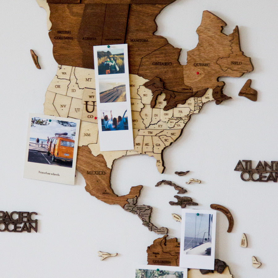
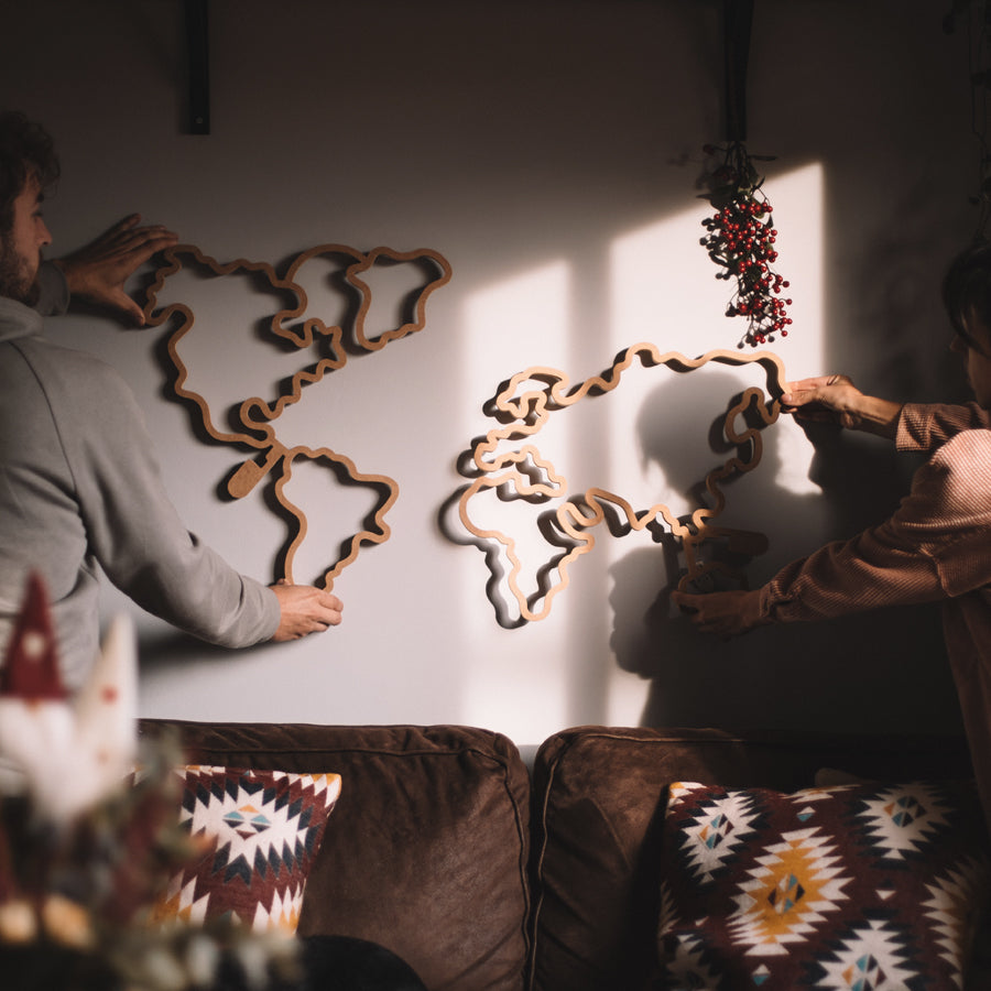
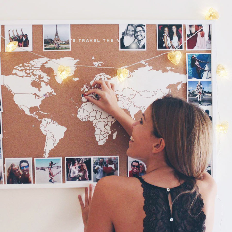
From Miss Woodwe use Miller's cylindrical projection to represent our decorative maps that we know will help you learn about our world in a clear, simple and fun way.
Give life to your environments with one of our Woody Maps and come with us to travel around our wonderful planet.